The difference between data and information is revealed by processing and presentation.
In it’s simplest form data becomes information when it is selected, sorted, summarized and compared.
Before we look at analysis of a social network it’s useful to remind ourselves how this is performed with mainstream data to provide meaningful information.
Traditional example of Sales data
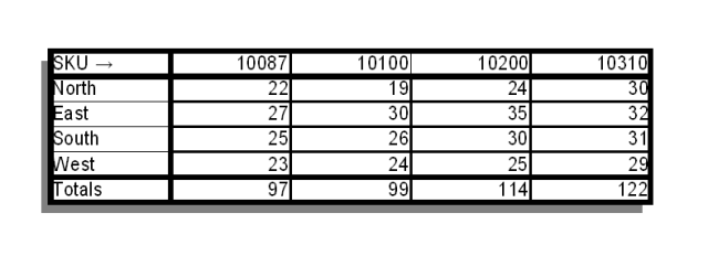
Lets look at a set of toy sales data:
SKU:10087 North 22, East 27, South 25, West 23
SKU:10100 North 19, East 30, South 26, West 24
SKU:10200 North 24, East 35, South 30, West 25
SKU:10310 North 30, East 32, South 31, West 29
Mathematical Analysis
Taking this data, arranging it into a table as below and providing simple totals allows us to draw comparisons more easily than from the base data.

Visual Presentation
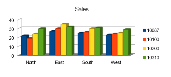
Taking this one step further by presenting the information as a simple bar chart as below allows us to see the whole picture with more clarity.

Visual Analysis of Social Networks
We’ll look at Social Network Analysis of Facebook as it is relatively easy to understand and is used by
a wide cross section of society. The principles apply to LinkedIn and Twitter as well as other more exotic networks.
Base data
With Facebook the base data elements we consider are;
- names of friends,
- links to other friends,
- number of posts
There are other metrics available but these suffice for this example.
Lets look at a small toy Facebook network.
Martin; 20 posts is friends with Alison, Jon, Neil, Helen, George and Nigel
Alison; 5 posts is friends with Martin ,Jon, Neil and Helen
Jon ; 50 posts is friends with Martin, Neil, Alison and Helen
Neil ; 10 posts is friends with Martin, Jon, Alison and Helen
Helen; 75 posts is friends with Martin, Jon, Alison and Neil
George; 20 posts is friends with Martin and Nigel
Nigel; 50 posts is friends with Martin and George
Mathematical Analysis
There are several useful ways of looking this data.
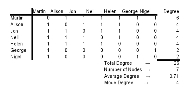
The first obvious step is to place the data into an array (called an undirected associative array)
If you are not familiar with arrays like this they are read as follows:
The rows and columns represent the names in the list: Martin, Alison, Jon, Neil, Helen, George, Nigel reading top to bottom and left to right with a 1 indicating that a connection exists.
After arranging the information like this it is easy to calculate each person’s (i.e. node’s) Degree by counting the number of 1’s. From this the average Degree can be calculated by adding the individual degrees and dividing by the number of nodes.
In this case this appears as follows:
This allows us to identify highly connected nodes (those with high Degree) and those with less connections.
Visualisation
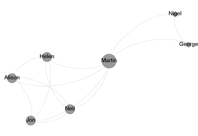
A simple visualisation by entering the information into Gephi showsthe information graphically. This immediately makes obvious some facts missed from the figures alone (please see example).
It’s obvious from the map that two separate groups exist. It’s also now obvious that although Martin is high degree it is because he is a broker between two groups and his influence in each is in fact average.
It’s also possible to add other information to make the distance between the nodes dependent on other measures such as a weighting to further emphasise the data but that is beyond the scope of this primer.
Temporal Representation
Once you have mapped a network it is possible to keep track of additions to further identify interesting nodes – See the revision of our example map below as an illustration of how a nodes importance can shift.
You can see from the above example that a new group is adding through Alison and again her influence in the first group hasn’t increased but she is now in a brokerage role between the existing group and the emerging group.
More Information
If you want further explanations of any of the terms here please look at the page SNA Basics
Some nice alternative examples here
An overview of SNA here


